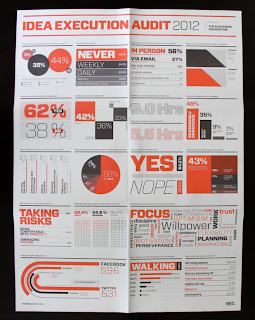
For the publication and newspaper of this project i am wanting to present it in an infographic style. This is because i am aiming at working professionals - office workers, so i think this style will work to appeal to them. Also displaying the stats in this way is really effective and visually pleasing too.
Here are some examples which i think are a good example of this:
I like how the page is split into different sections with the lines and each section is a different infograph. The colours work really well together too.
The above images are all of one campaign. I like how the different formats have been used and everything works as a set together - with the colour, layout and reasoning. Each product has a reason fr being included and there is nothing that just there for the sake of it.
Again another take on the first poster. I like the green against the black in this design - it makes it stand out and makes it eye catching.
Again the above images are of one campaign. Here the newspaper is the main focus and i love the design of it. I can alot away from this to use in my own newspaper design. The layout and content of it is great.
Info graphic annual report. This shows how it works both across print material and web. Which is the basis of this brief for us too. I like the use of trace on the front cover and the design of the front cover too.
The above images are that of a publication. Again the infographic style is running all the way through. The design of this is consistent on all pages and makes something interesting to read. I like how the pages fold out to make a bigger page / poster. The colours used are all good too.
I like the layout of the posters. The info graphs also work to display the information but also look like an image too which i think is very clever.
The colours on the above images are great - i like the green black and yellow, they all work well together and contrast each other. The design of the is consistent across all three products. You can see that the same grid and structure has been used, just tweaked for each product. It is great.


No comments:
Post a Comment